
In 1964, the Tate Gallery of Modern Art saw the arrival of Roy Lichtenstein, the first American artist to exhibit at the Tate. The reactions of the British public were far from impressed. Now, 49 years later, his legendary works drawing on 1960s American pop culture are once again reunited in a blockbuster retrospective in the same venue. This time, the views of the British public are much more open.
Tate’s latest exhibition consists of 125 paintings and sculptures categorised into 13 different rooms, from his early Abstract Expressionist works through to his fascination with Chinese landscapes from the Song Dynasty. And yes, most of them are covered with dots.
Room 1 introduced us to his brushstroke paintings – parodies of Abstract Expressionism. This movement dominated American art in the 1950s, led by artists like Jackson Pollock and Willem de Kooning. Lichtenstein had previously attempted this style of art, shown in Room 12 of the exhibition, but he struggled and little attention was paid to them. So he looked for a new style.
Room 2 brings us face to face with his early Pop art paintings, one of which is a cartoon depicting Donald Duck and Mickey Mouse. Look Mickey 1961 is based on an illustration from Donald Duck Lost and Found 1960 and shows his introduction to his new style, and the beginning of his legacy as one of the greatest and influential Pop artists of the 20th century. Also featured in the room are his commercial-themed paintings such as Spray 1963 and Step-On Can With Leg 1961, all dominated by Ben-Day dots and flat blocks of colour.
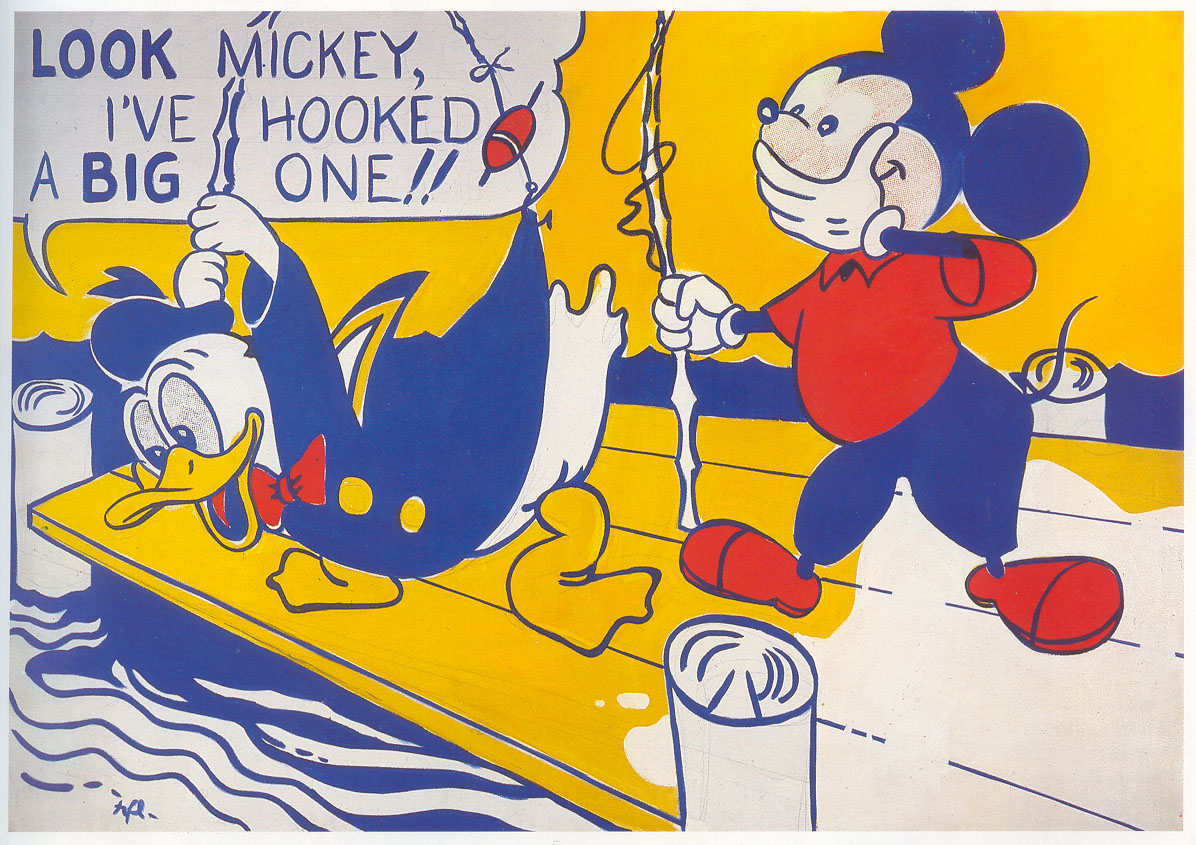
Roy Lichtenstein, Look Mickey 1961. Image via www.wendistry.com.
Monochromatic black-and-white paintings fill Room 3, with Ceramic Sculpture #7 1965, a set of spotted cups and saucers, in a glass display near the centre of the room. I told myself I would buy them if I ever had the chance…and the money. This room focused on the reductive graphical rendering of commercial images, depicting everyday objects such as Ball of Twine 1963 and Tire 1962. However, the painting that caught my eye was Portable Radio 1962, a painted canvas evoking the form of a radio with a single leather strap fixed on either side of it. Lichtenstein wanted to emphasise the materiality of the painting, saying “the painting itself could be thought of as an object.”
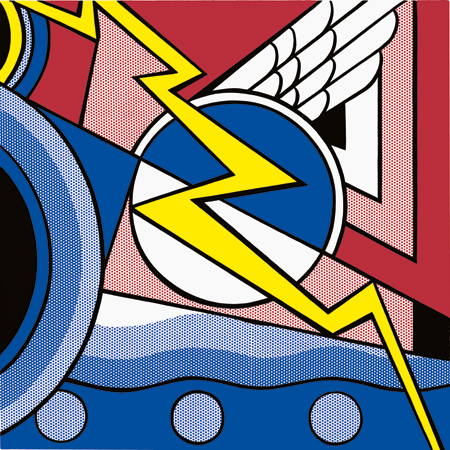
At last! Room 4 gives us the recognisable works of the Lichtenstein we all know and love, with iconic paintings like Whaam! 1963, Masterpiece 1962 – a fortunate self-fulfilling prophecy –, Oh Jeff…I Love You, Too…But… 1964 and Torpedoes…Los! 1963. These reinterpreted comic book illustrations drew on themes of puppy-love during the war, exploring the American mass media’s portrayal of gender roles and melodrama. The room also contains two sculptures of explosions and my most anticipated work in the exhibition, Head with Blue Shadow 1965, a dot-covered female head.

Roy Lichtenstein, Whaam!, 1963. Image via www.tate.org.uk.
In Room 5 we got to see his land- and sea-scape paintings, a much calmer genre for him to experiment with his newly-found style. The paintings are simple compositions of Ben-Day dots, arranged to form overall horizontal lines in varying concentrated colours. Sea Shore 1964 stands out from the rest of these paintings by creating the illusion of movement by painting dots on two overlapping layers of Plexiglass.
Room 6 contains works that remind me of hat stands, since it features tall, brass sculptures that take on elements of Art Deco architecture. I liked them because they were shiny. Two paintings also feature in this room: Modern Painting with Bolt 1967 and Modern Painting Triptych 1967. I particularly liked the former since it showed Lichtenstein’s technique of isolating a white area with colour to create the impression of white dots in the overall composition.
Modern Painting with Bolt, 1967. Image via www.lichtensteinfoundation.org.
Room 7 saw Lichtenstein’s artistic dialogue with great artists throughout art history. He rephrased in his own style the works of Picasso, Matisse, Mondrian and Monet, whose Rouen Cathedral series 1892-4 meets our eyes as we enter the room, reinvented with the Ben-Day dots that Lichtenstein has literally made his own. Behind the same wall are a collection of studies, also based on other artists, one of which is The Red Horseman (Study) 1974 that is recognisable as the Futurist Carlo Carra’s The Red Horseman 1913. Within this room are also colourful sculptural works that are more figurative in context yet still evoke the forms of their brass, counterparts in the previous room.
Lichtenstein also painted a series of artist’s studios but with the inclusion of his own works, shown in Room 8. It gave him the opportunity to rephrase his works as well as appropriating them in the same way he appropriated the works of others.
Room 9 introduces us to his experimentation with the imagery of mirrors and entablatures. He conveys the reflections of the mirrors by using varying sizes of dots. This room also introduces us to Self-Portrait 1978, a ‘portrait’ that replaces his head with a mirror. This play on his essentially branded style, possibly even a tad egotistic, is actually rather daring, yet it works quite well with us, since one only needs to glance at the painting to correctly identify the artist who made it.
Room 10 features a lesser known series of works called the Perfect/Imperfect series. These works explore abstraction and geometric fields of colour that challenge the edge of the canvas. You’ll see the lines of the Perfect paintings fit within the field of the canvas, while those of the Imperfect paintings will physically come out of the edge of the canvas before turning sharply back into it. Personally, I really like the latter.
In Room 11, we see Lichtenstein’s shift to the classical genre of nudes in the late 1990s. Again, he based these on comic strip illustrations, stripping the original characters of their clothing and reinterpreting them as sensual nudes. However, his rendering of them almost makes them merge into the background, paralleling graphical illustrations, where the focal point of the illustration is just as insignificant as the rest of the image. In the centre of the room are also two sculptures – Woman: Sunlight, Moonlight 1996 and Galatea 1990 – the latter of which is reminiscent of Picasso’s distorted imagery of his lovers.
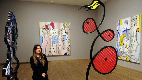
Woman: Sunlight Moonlight, 1996, (left) and Galatea, 1990, (right) amongst a selection of nude paintings. Image via www.itv.com.
The penultimate Room 12 is an intimate room that takes us back to Lichtenstein’s struggling Abstract Expressionist works, together with a few late brushwork paintings that juxtapose against geometric shapes.
Finally, the exhibition ends with his attempt at rephrasing Chinese landscapes using his Ben-Day dots…and quite successfully, too! These works are much more graduated than their earlier landscape counterparts in Room 5. The alteration of dot sizes seen in his mirror works are used in such a way that they create a sense of tranquillity in these late works, successfully mimicking the effect of their predecessors.
As an artist, Lichtenstein seems to bear resemblance to Picasso, through his use of appropriation. On the other hand, they are completely different since Lichtenstein stayed loyal to his style to the very end, essentially branding it, but Picasso, as most tend to argue, didn’t really have a style to stay with. Lichtenstein could also be seen as a Damien Hirst-like figure, both being figures that people could associate with specific themes or objects, Lichtenstein with his dots; Hirst with his formaldehyde and imagery of death. The context of his works are easily understood and the public can often relate to them, which is probably why an increasing number of people have grown to appreciate his art. The comic book layouts of his major works are appealing to both young children and adults, essentially turning low art into high art. The same point could be made about his works on commercial objects.
Overall, Tate has done a marvellous job of organising this exhibition. It provides an excellent overview of his career and features many iconic works that are rarely seen in the UK. However, I was rather disappointed with the layout of the paintings in the room. There were times, especially in the larger rooms, when the works felt a bit too small to fill the rooms, thus breaking the illusion of a prolific number of exhibited works. Nonetheless, it is a worthwhile exhibition and a definite must-see for all you art-lovers out there!
I hope they do Andy Warhol soon…
By the way, for those of you who are interested in the Ben-Day dot technique, the graphic designer Paul Coldwell is currently exhibiting his works in the Studio 3 Gallery at the University of Kent, Canterbury. It’s a tiny exhibition, but his combination of photography and Ben-Day dots is extremely insightful. Check it out!
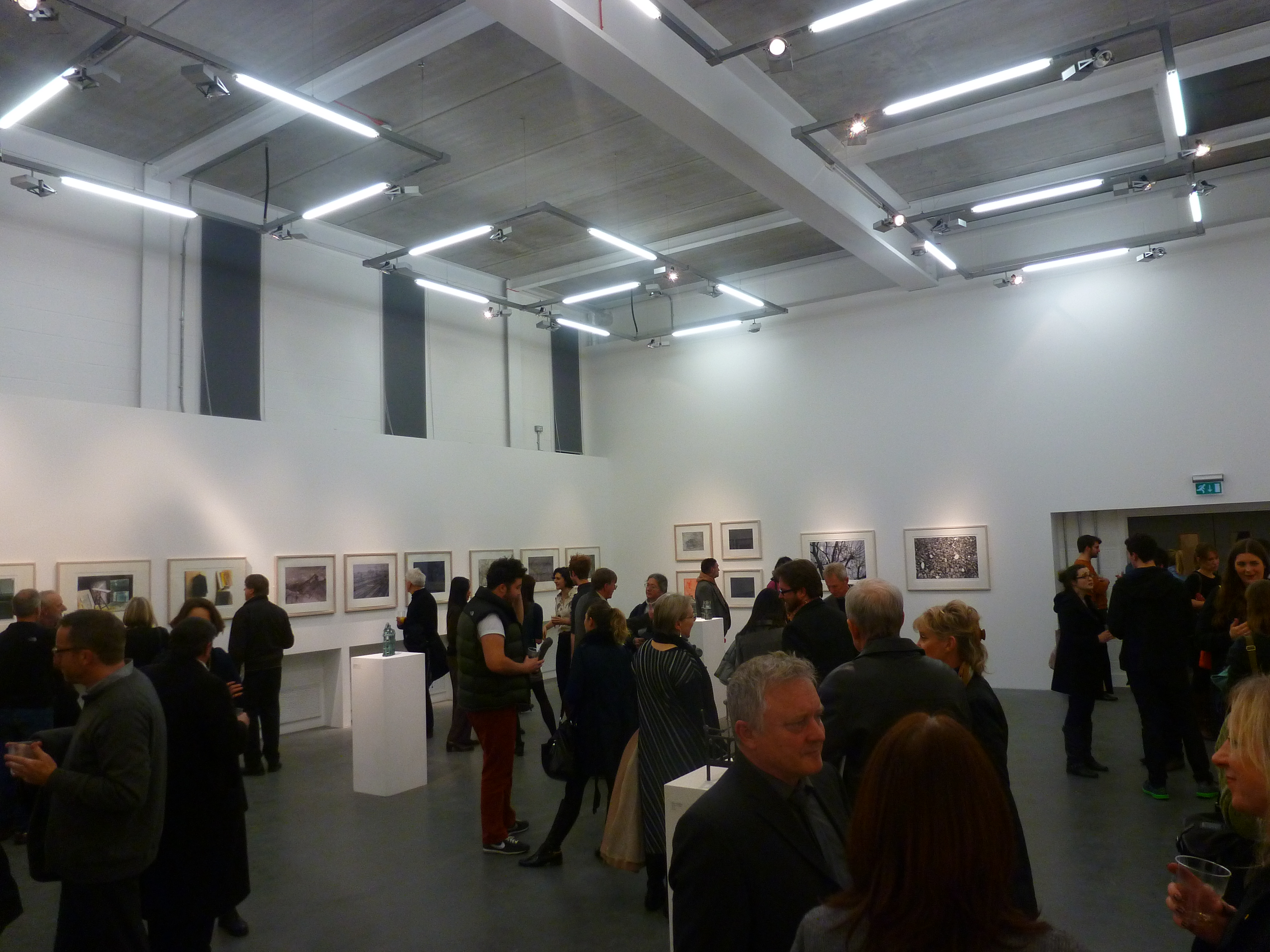
Private view of the Paul Coldwell exhibition. Own photograph.
Roy Lichtenstein: A Retrospective runs until 27th May 2013 at the Tate Modern, London, http://www.tate.org.uk.
Paul Coldwell: A Layered Practice – Graphic Works 1993-2012 runs until 5th April 2013 at the Studio 3 Gallery, University of Kent, Canterbury, http://www.kent.ac.uk.


Leave a comment