


Description:
Exhibition and Catalogue
Organised by 2nd- and final-year School of Arts students at the University of Kent, Beautifully Obscene was an exhibition designed to challenge prevailing notions about the ‘nude’ and ‘naked’ body in art.
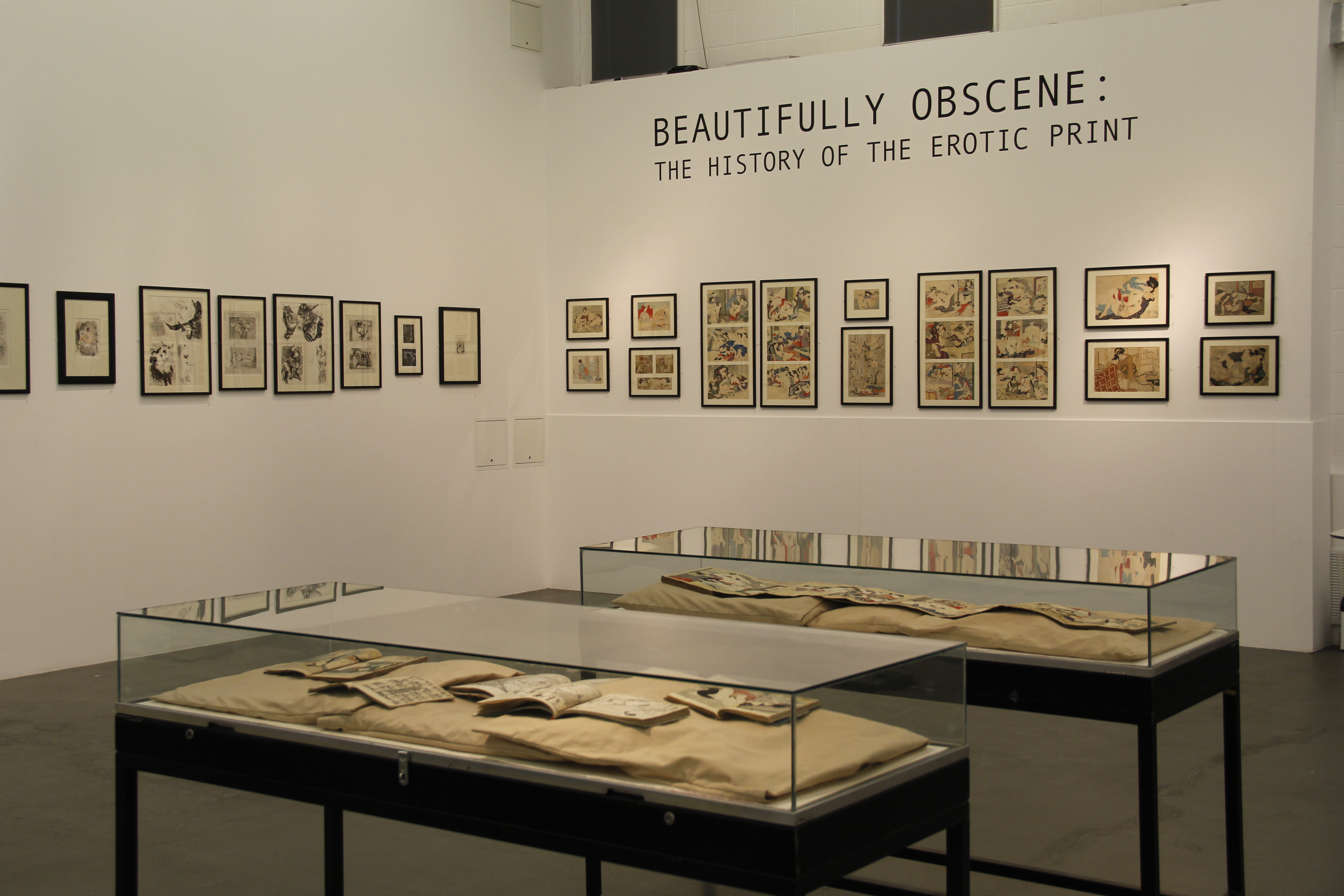
Spanning 500 years of history and featuring nearly 50 prints from Europe and Japan, this sensitive exhibition also explored themes of power, sexuality, and gender roles.
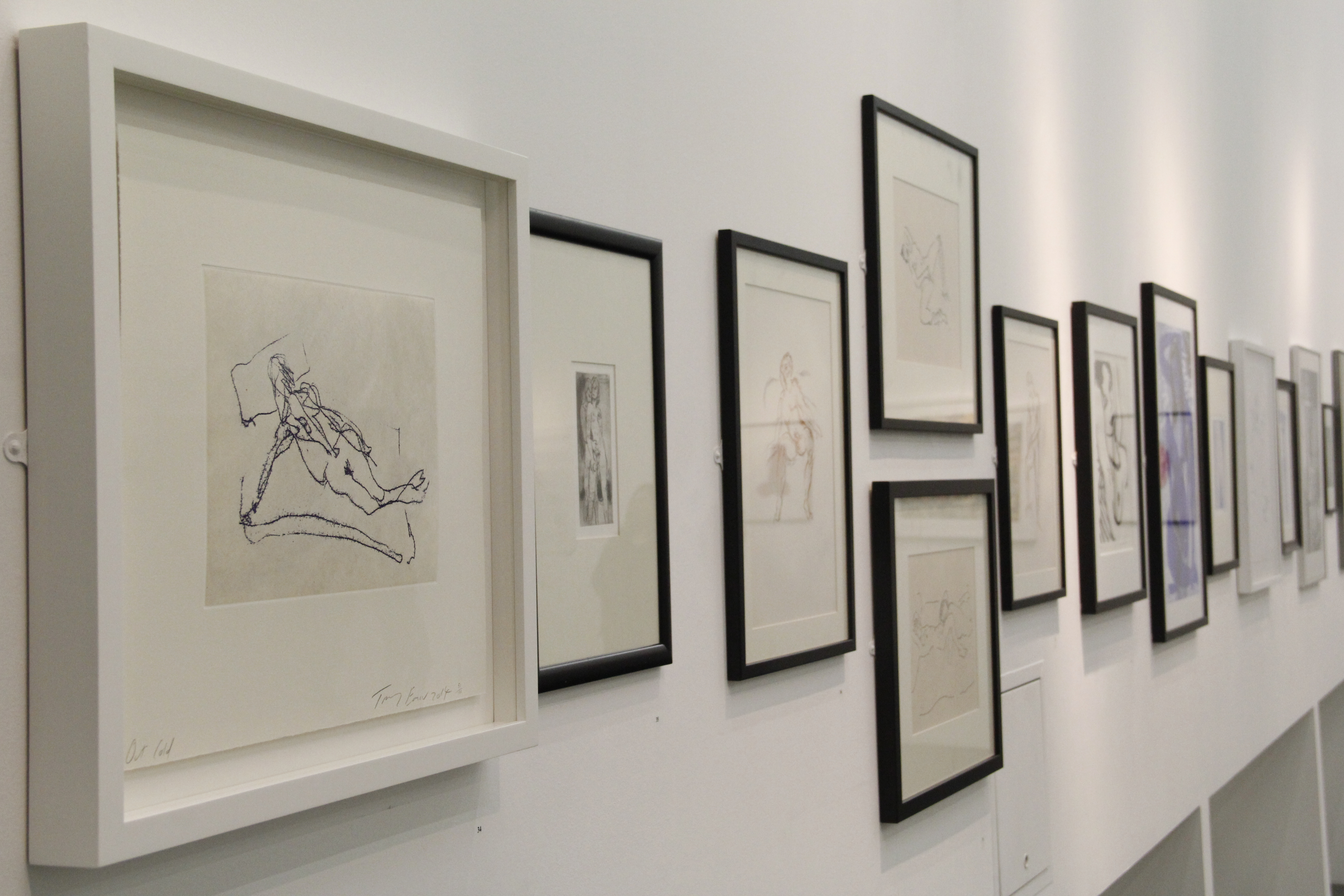
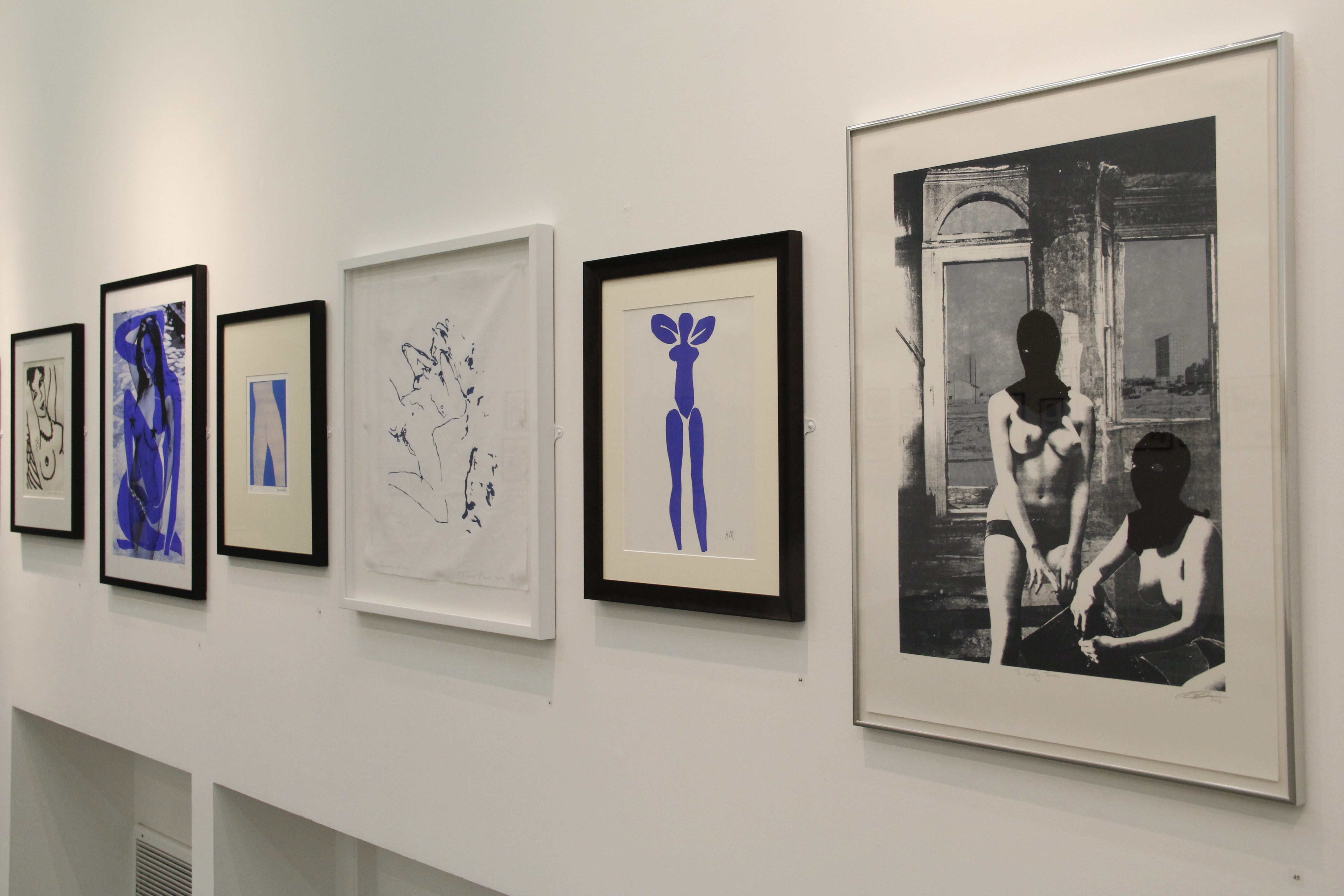
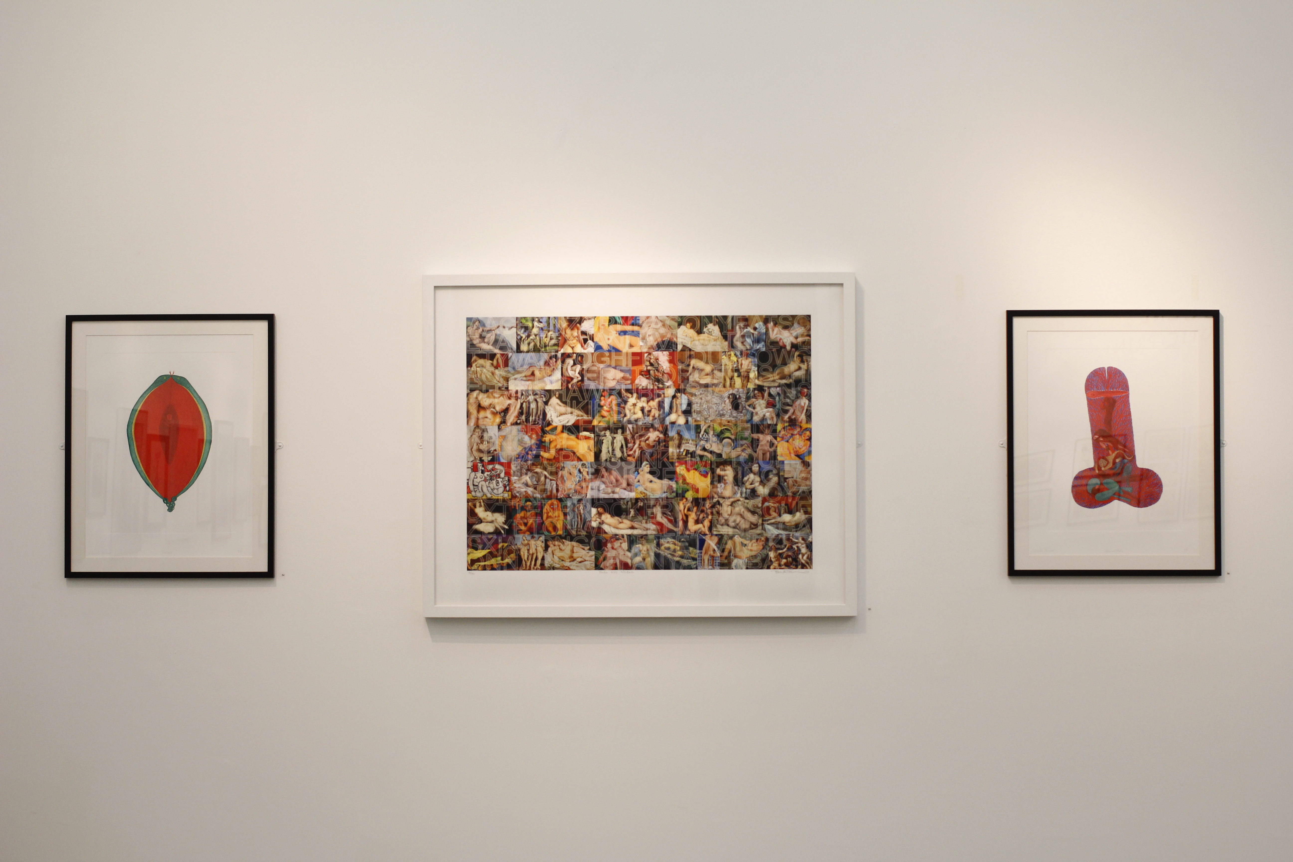
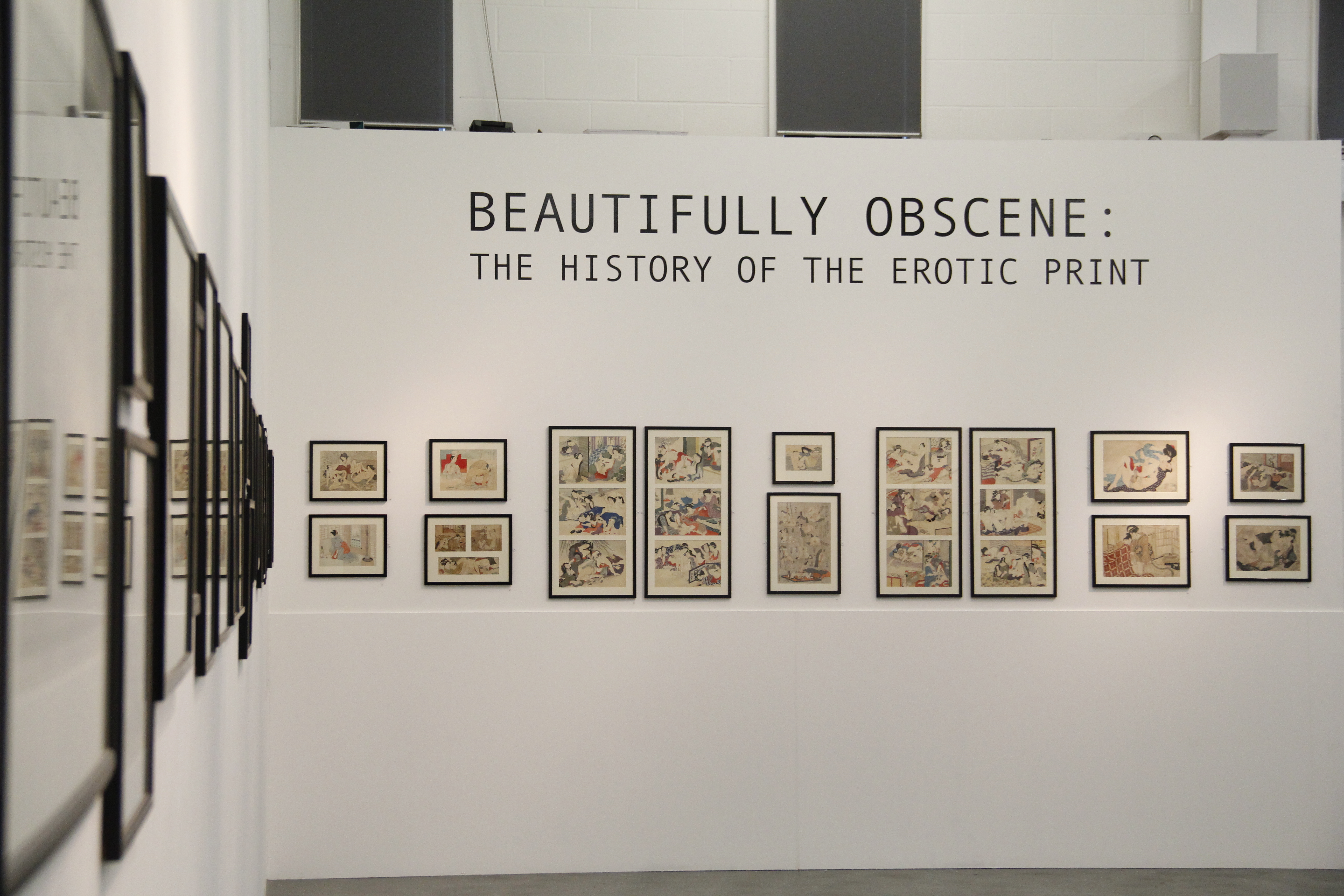
Artists included Simone Cantarini, Tracey Emin, Sarah Hardacre, William Hogarth, Albert Marquet, and Felicien Rops. A spectacular wall of Japanese shunga prints also greeted visitors upon entry.
I had three main roles:
- As the exhibition’s catalogue editor, I successfully led a six-person team from concept to print.
- As co-curator, I revised the exhibition’s narrative and educational aims, liaised with external lenders to negogiate a third of the exhibition’s loan list and display materials, and organised delivery of framed works.
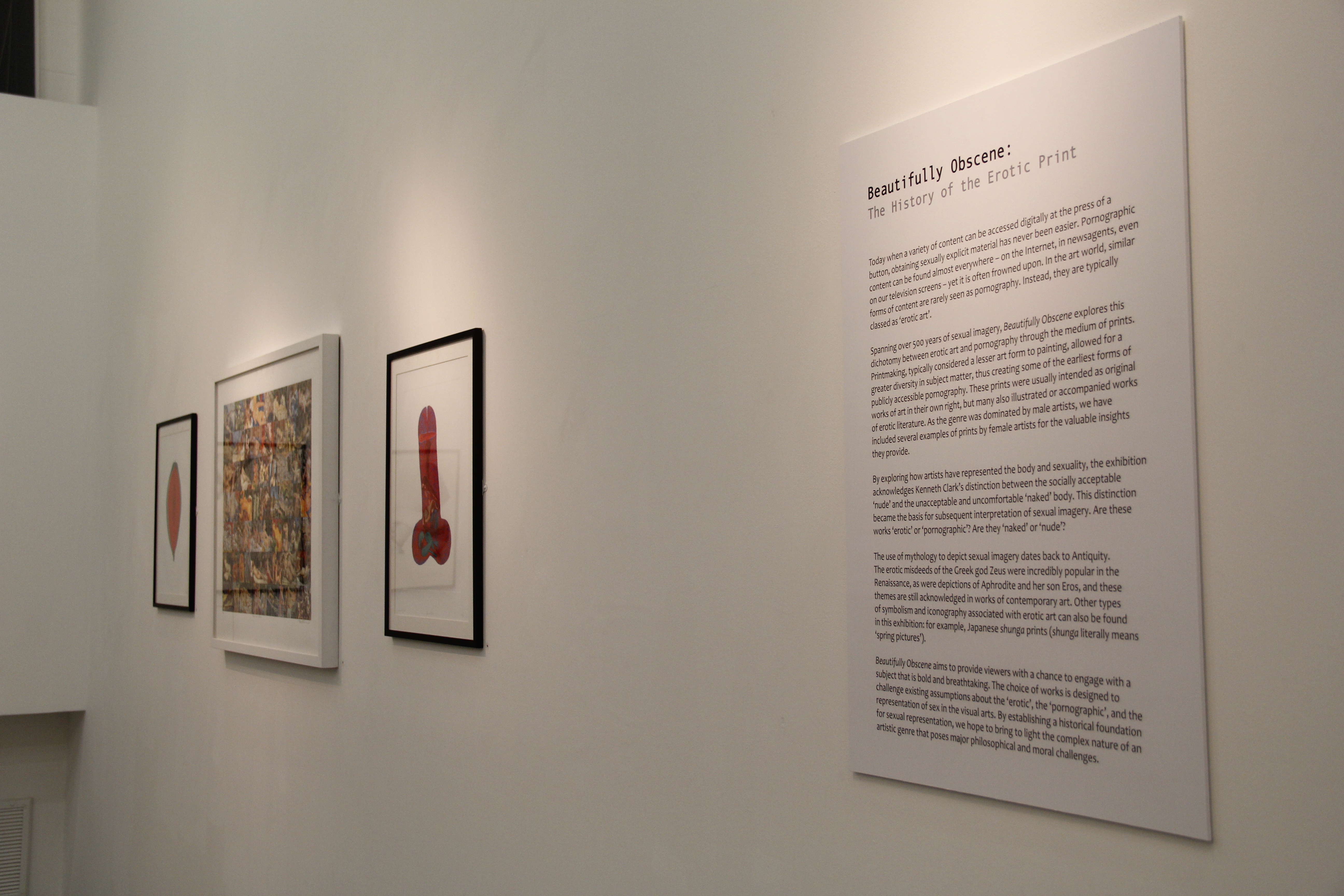
- My expertise in writing accessible texts meant I was responsible for creating the exhibition’s introductory text panel, captions accompanying each artwork, and large-print guide.
Exhibition
The project started with a bidding war for exhibition proposals from several groups of students, including myself. The most-voted proposal went on to be developed further by the entire class.
We identified two major issues during the winning proposal’s redevelopment:
- The original concept, as is, was too risque too soon on the visitor trail.
- There was a major gap in cultural representation within the historical timeframe being discussed; the initial selection consisted solely of 18th-century Japanese prints and 20th- to 21st-century Western European prints.

To address both problems, I suggested a broader historical timeframe, grounded with a chronological display of Western European prints from the 16th century to the present day.
This offered several solutions and was successfully implemented in the final product:
- A coherent timeline of Western art allowed the Japanese shunga prints to act as a point of contrast, particularly with regard to cultural differences and social norms about representations of the nude.
- Using 16th- and 17th-century Western prints at the start of the exhibition served as an accessible introduction to this sensitive topic via commonplace representations of Adam and Eve, other Biblical figures, and mythological deities from Antiquity.
- The representational scope of 18th-century works was widened, offering an ‘apples-to-apples’ comparson between Western European and Japanese approaches to erotic and explicit subject matter.
- The more explicit prints spanning the 19th to 21st centuries had a stronger, educational justification for inclusion due to the exhibition’s renewed aim to present a historical development of nude subject matter in art history.
When the Japanese shunga prints arrived, some were still in their bound form and could therefore not be framed like the others.
To resolve this issue, I arranged for the temporary loan of two display cases from the university’s Templeman library, and several cushions from the Canterbury Cathedral archives.
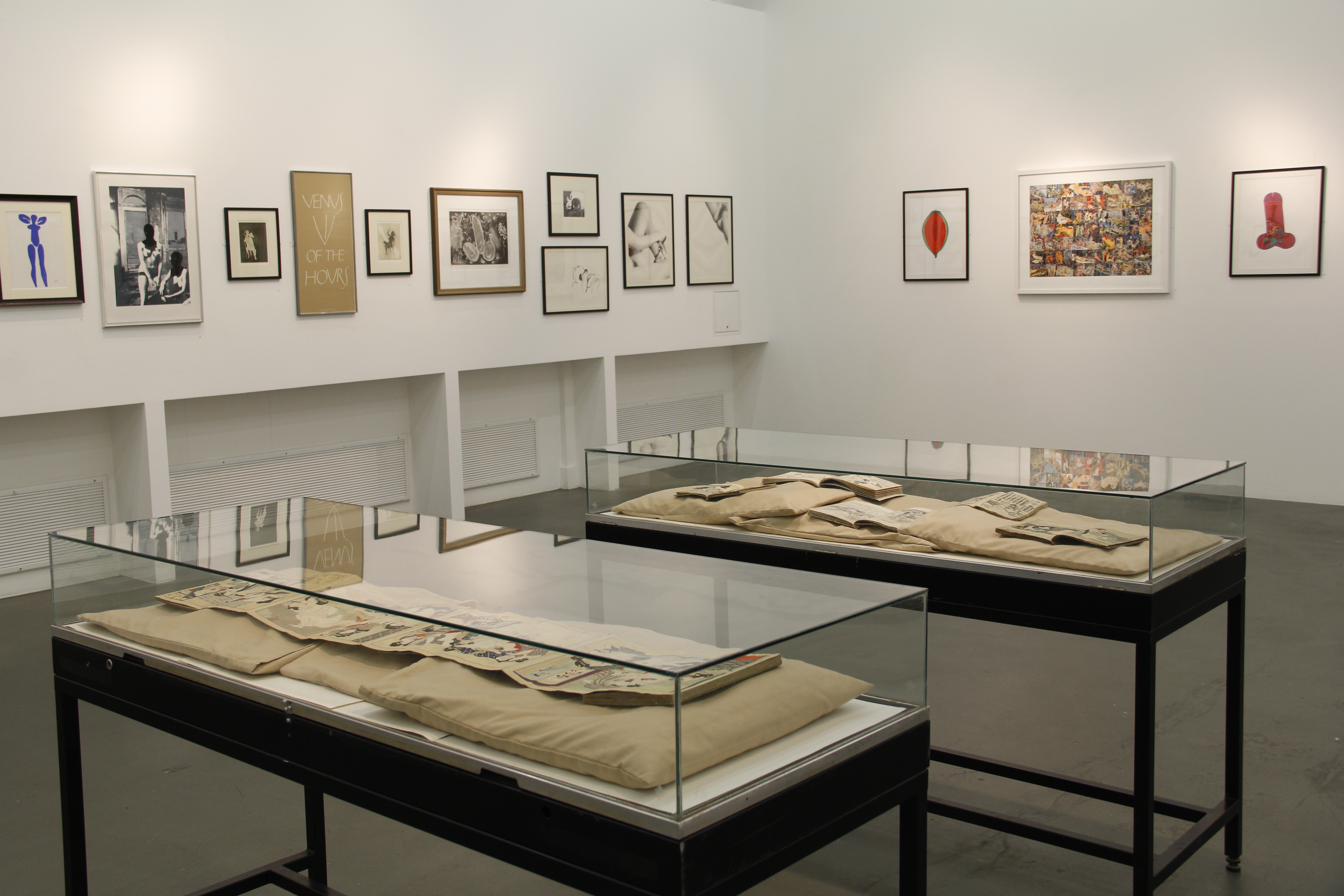
With my assistance arranging delivery of framed artworks from the local framers, the exhibition’s installation went without a hitch, opting for a centre-aligned, chronological hang with a layered approach for smaller works.
Photography and installation shots were taken by me.
With a total visitor attendance of 809, my services were instrumental to the exhibition’s success, making it Studio 3 Gallery’s most-visited exhibition in its history.

Catalogue
After the exhibition ends, its legacy is served by the catalogue. This was entrusted to my six-person team.

Design
Studio 3 Gallery has a consistent reputation for producing square-format exhibition catalogues; we felt it was fitting to do the same.
We created several mock-ups for the front cover, incorporating specific works in the exhibition.
In one such mock-up, we considered the School of Art’s own red-and-black branding, using one of the exhibition’s less shocking objects as the cover image.

The final product followed a design used by the marketing team, incorporating pastel colours, circles, and a Japanese shunga print to evoke a peephole aesthetic. These circular forms were mimicked on the inside as a background for the page numbers.

Content
In keeping with common layouts for exhibition catalogues, we knew we wanted at least the following pieces of content:
- Curators’ introduction
- Thematic essays
- Catalogue entries
- Images
- List of exhibited works
- Acknowledgements
For thematic essays, we commissioned three external specialists:
- An art dealer and majority lender who contributed an overview of art history’s preoccupation with nude and erotic subject matter.
- A lecturer who offered a socio-political perspective to nudity and erotica.
- A PhD candidate who provided an in-depth study of Japanese shunga prints.
As sourcing copyrights for every object in the show seemed unrealistic, we settled on a smaller selection that still reflected the exhibition’s coherent timeline and diversity of themes.
This also determined the number of objects we could write catalogue entries for. The final amount was based on the number of in-house writers willing to contribute, including me and my team.
I contributed an entry on Jan de Bisschop’s etching of the Medici Venus, researched and compiled using past literature and a visit to the British Museum print room.
I also produced the list of exhibited works, and finalised the editing of the catalogue.
The cherry on top was our successful application for an ISBN number.
We enlisted the help of Ashford-based printing company Headley for the catalogue’s print run.
After reviewing some of their paper samples, we decided a smooth, matte finish would be most suitable.
The size and format adhered to previous Studio 3 Gallery publications.
Project Title:
Beautifully Obscene: The History of the Erotic Print
Client:
Studio 3 Gallery, School of Arts, University of Kent, Canterbury
Project Duration:
4 Months
Role:
Catalogue Editor
Co-Curator
Caption Writer

